

Showing posts with label knitsonik. Show all posts
Showing posts with label knitsonik. Show all posts
Thursday, January 5, 2017

Monday, April 4, 2016
Knitsonik Mittens Finished!
It's been a fascinating process, and I'm really glad I did it. Here is my inspiration:

Here are my finished mittens:

Knitsonik Mittens (ravelled here),
knit in Knitpicks Palette in Alfalfa, Grass, Thicket, Almond, Mist,
Sky, Chicory, French Lavender, Hyacinth, Blush, and Fuchsia
I think I like the palm of the mittens as much or more than I like the back. I love the simple, repeated pattern. There's so much going on color-wise that simple is best.

If you want to see more about the process, you can read about my inspiration, palette, color contrast, and charts from earlier posts. Here are some thoughts about the process from when I finished the first mitten.
I really like stranded colorwork, and I like that these mittens will always make me think of the original beautiful garden photograph. I'd be up for doing more projects like this!
Friday, April 1, 2016
Procrastination
I've never been a big procrastinator. You can choose to feel impressed by that, or you can choose to know it's more obsessive behavior than virtue. To-mae-to, to-mah-to.
Despite that, I've been avoiding the second Knitsonik mitten. So many ends! So many color changes!
Tuesday, I decided I was being ridiculous, and I started. Of course, once I began, I really enjoyed it. I love stranded colorwork knitting. I don't know why I thought this was going to be unpleasant.
Yesterday at the end of my lunch hour, I had this:
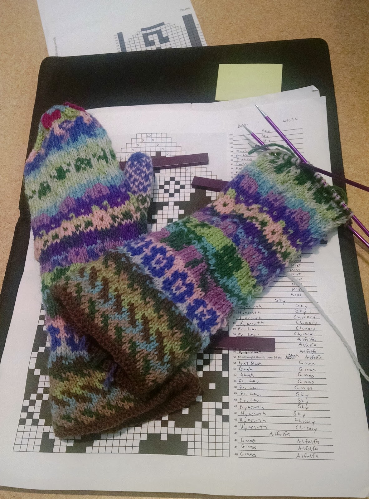
I have the tip of the mitten and the thumb to knit. Then it's weaving in the ends and blocking. True, there are many, many ends, but, even so, we're not talking about a lot of time left to finish this.
Let this be another reminder to me that the thinking about doing something is often much more unpleasant than the doing of the something. For people like me, the motto needs to be: Stop thinking. Just do.
Monday, March 21, 2016
Knitsonik: Color Contrast
Well, huh. I thought I published this, but apparently I didn't. If anyone is still interested in my Knitsonik process, here's the bit about contrast!
There was still a bit of daylight when I got home from work yesterday, so I took advantage of it to get a couple photos of the yarn.

When I look at it as a black and white image, I was really surprised. That third column looks really, really similar. I wouldn't have thought that three such different colors (thicket, grass, and fuchsia) would have the same contrast.

My swatch is actually going to be a pair of mittens. (I'm not enough of a process knitter to do a 4' swatch. Know thyself.) I resized the motifs to go over 32 stitches, put them in an order I liked, and marked the decreases and where the afterthought thumb will go. I think I'm going to do the palm in knit 1 stitch main color, knit 1 stitch contrasting color, repeat. I'm as excited to see how that will look as I am to see how the motifs look.
I tried to avoid putting colors that look like the same gray together.


It took me quite awhile to make the plan for the colors. In the end, I had to accept that I have no idea how this is going to turn out. I've reached the point where it's time to just start knitting and see what happens!
Friday, February 19, 2016
Knitsonik Mitten #1
I've knit my first Knitsonik mitten. As a reminder, I started with this inspiration:

Chose this palette (ended up not using the yellow):

Figured out some charts, and then started to knit.*

Some things really worked, and other didn't so much, but the whole point of swatching in this process is to play around and see what works and what doesn't. This is hard for me, but probably really good for me, too.
I couldn't accept that the swatch would just be decoration, so I took a risk and knit the swatch as a mitten.
I think one of the sections that worked the best was the cuff. I did a double cuff. The inside is plain brown, because all gardens start with a base of brown dirt. I knit approximately 20 rows of plain brown, put in a purl row, and then started the patterning. When I'd done the same number of patterned rows as I'd done plain, I folded the inside of the cuff, held the two layers together, and knit them together on the next round. This is not as easy as I make it sound, and my cuff's a bit wonky. It wasn't wonky enough I needed to rip, so I didn't.
Anyway, the pattern part of the cuff is inspired by the path in the photo.

The circular flowers are the pink flowers from the back, right side of the photo. The green vine and leaves represent the abundance of green foliage.

The stars represent the balloon flowers. The heart I added because I needed a small motif for the decrease portion of the mitten, and I'm kitschy and adorable like that.
The section that really didn't work is the green/mist section between the stars and the circular flowers. The outline is done in the light mist color, and I think it was just too light to show up properly. Still, that's what experimentation is for.

I contemplated the thumb for awhile. My first inclination was to match it to the mitten exactly, which means I would be changing colors every couple of rounds. For a 30-stitch thumb, that sounded like madness. Not only would I have a lot of yarn ends that would bulk up the material of the thumb when I wove them in, but I thought I might lose the will to knit before I reached the top of the thumb. Instead, I used the same pink (blush) for the whole thumb and just switched the background color once. I feel fine with the way it turned out.

A surprise for me is how much I love the palm! I think it's beautiful. This is the same pattern I used on the Swirly Mitts 2.0.

I'll make its mate soon, but perhaps I'll allow the sting of that many ends to weave in fade a bit before I do.
*This would look better blocked, but I'm not blocking it until I have its mate finished. Use your pretend eyes and imagine that it's blocked, please.
Friday, February 12, 2016
Lost and Found
On Monday morning as I was getting ready to head out the door to work, I went to grab my mittens.
There was only one mitten on the table.
That night, I checked more carefully. Did it drop out in the car and get kicked under a seat? Is it in my work bag? Have I worn a different coat recently? How many times can I check the same coat pockets before it becomes obsessive behavior?
It was gone.
On Tuesday, Andrew, because he is a saint, went to Target after work and looked through their lost and found. He walked the pond I'd walked around on Saturday, diligently searching.
It was gone.
I told myself the usual things: It's just a mitten. I knit it and loved it, but I love to knit and can make another pair. I'm planning to knit a pair for my Knitsonik project anyway. It's fine.
Lies, all, but what else could I do?
This morning, I was walking Dexter and looked down. My mitten! I brushed the salt, leaves, and bit of snow off it, and this weekend it will get a proper bath. (That didn't stop me from wearing it this morning though.)
It was on the edge of the road. I'd walked right over it more than once this week but never saw it. I know why. My brain is filled with Knitsonik information, and when I look at this:

I definitely see this.

It was hiding in plain sight.
Wednesday, February 10, 2016
Knitsonik: Charts
After choosing inspiration and taking my best guess on a palette, the next step in the Knitsonik process is to start charting.
Let's get a little bit real: I have many wonderful talents and qualities. However, I do not excel in visual learning. The idea of creating charts from scratch makes me feel sad and defeated.
Sad and defeated is not in the spirit of creativity and joy that Felicity Ford is trying to give me by helping me play with my knitting.


Let's get a little bit real: I have many wonderful talents and qualities. However, I do not excel in visual learning. The idea of creating charts from scratch makes me feel sad and defeated.
Sad and defeated is not in the spirit of creativity and joy that Felicity Ford is trying to give me by helping me play with my knitting.

Preach on, Brother Voltaire. Preach on.
So, I searched the Internet and took motifs that I loved and put them in Excel. (I found it challenging because, again, not terribly visual.)


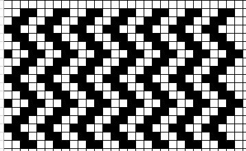
This I'll do in at least one shade of brown, to symbolize the path.
These feel like the pink flowers in the background (not the echinaceas--the smaller ones).

The white area I'll do in the light mist color.

These are for the purple, star-shaped campanula.
For some of the motifs, I see exactly how they connect to the photo (top picture here). For some, I don't. I don't have a great echinacea motif, for example, and I've decided that's fine. These charts make me happy. They feel like flowers to me. That's enough.
The next step is to resize them so they're all a factor of 64. Sadly, and I feel I should have prepared you better for this revelation, I lost a Dither mitten. It's upsetting but not a tragedy.
It has made beginning this stranded knitting project more time sensitive. There's snow on the ground and I'm wearing store bought mittens.
Wednesday, February 3, 2016
Knitsonik: Palette
The first step in the Knitsonik experiment is to choose an inspiration. Mine is this photo:

The next is to pick the palette. Choosing colors was trickier than picking the inspiration photo, but it was pretty fun. I happily spent a lunch hour comparing colors, cutting out possible shades and putting them together. I ended up with 12 colors. I'm not sure if that's too little/too much/just right in the Knitsonik world, but I suspect there is no wrong answer. Just right it is!

Click to enlarge.
First column: Mist, Blush, Fuchsia, Alfalfa, Grass, Safflower
Second column: Almond, Thicket, Sky, French Lavender, Urchin*, and Hyacinth
All yarn is Knitpicks Palette.
You're supposed to start with a Basic Palette, matching colors as closely as possible to the colors in the inspiration photo. Then you add Question Colors, which is a way to expand the palette and focus on the more nebulous aspects of the photo (texture, light). I think it's also an important way to expand the colors I'm using so it's not quite so literal.
In an ideal world, I would be comparing these colors using a swatch card. Here's the truth: I'd rather spend $15 on yarn than on a swatch card. Therefore, I choose to do my best based on images I see online, recognizing that this may bite me on the ass. Risk acknowledged and accepted.
The part of the process of choosing colors that is most difficult for me is determining the contrast between the colors. If the colors are too similar in terms of warmth/coolness, they won't stand out well. If you'd like to see a striking example of this happening, I direct you to my teal/purple Fightin' Words Mitts. Unless I'm in bright light, these two colors don't show the pattern well. (See the bottom picture here to see--well, not see it best.) The two colors are too close tonally, I think.**
I honestly have no idea if I have enough contrast here. I also don't know how to figure that out, so I'm going to hope for the best. I like the colors themselves, so if any do not work for this project it can become something else somewhere down the line.
A friend gave me a Knitpicks gift card for my birthday. Purchasing the yarn for this project feels like a perfect use of it. Onward, ho!
*At the last moment, I took Urchin out of my cart and put in Chicory. It is my nature to overthink things. I'm fighting it, but... baby steps.
**I know very little about which I speak.
Tuesday, February 2, 2016
Knitsonik: Inspiration
There are two main projects residing in my brain that come up when I think about slowing down and really taking time to delve into the process of making something. One is to do the measurements and reading to figure out what sort of sweaters flatter my body type (using Amy Herzog's two books). The second is designing a stranded knitting project based on a photo/object that I love using the guidance of Felicity Ford's Knitsonik book.
The sweater feels like something I should do, and the stranded colorwork feels like something I want to do. Colorwork it is!
I'm determined to slow down and work through the process. First up: Find inspiration.
It seems like the logical place to go is my own pinterest page. I chose three images:


The sweater feels like something I should do, and the stranded colorwork feels like something I want to do. Colorwork it is!
I'm determined to slow down and work through the process. First up: Find inspiration.
It seems like the logical place to go is my own pinterest page. I chose three images:

Dahlia 'Princesse Gracia'

Perennial flower border

My very favorite book
The dahlia is beautiful, but probably not right for this type of project. I'd need more elements--leaves, stems, etc.
Both the second and third photos would work, I think, and both would be fun. The flower border has more obvious elements to work with, more colors, more shapes. I love the colors in the photo, so many blues, purples, greens, and pinks.... delightful. My guess is that I'll make mittens, and looking at mittens inspired by a beautiful flower garden will brighten a dreary winter day.
I'm excited! Next step: Picking colors.
Subscribe to:
Posts (Atom)